Monday, 22 October 2018

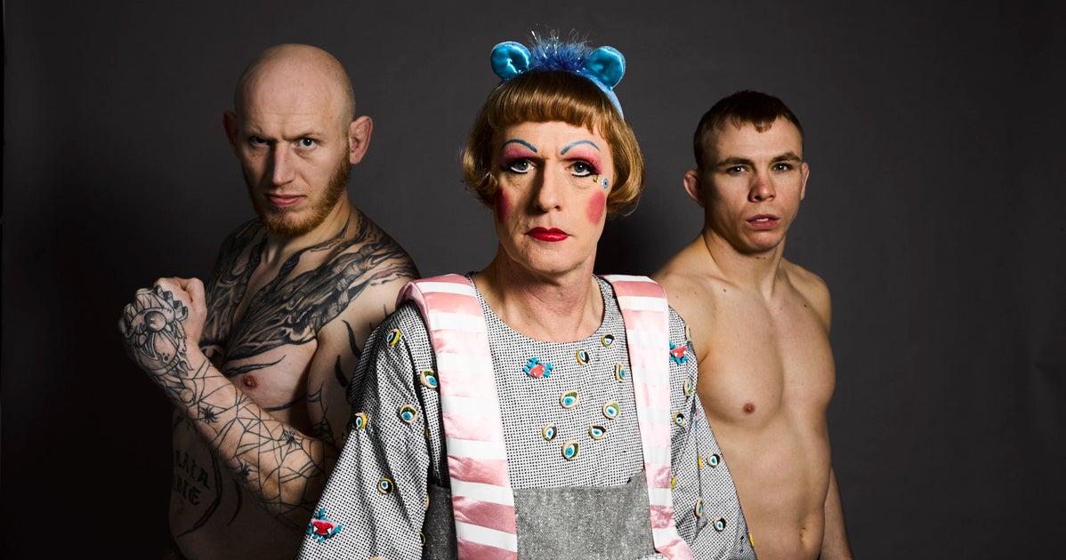
COP 3 - Grayson Perry - All Man: Rational Man - Notes

Image result for grayson perry all man rational man

Image result for grayson perry all man rational man


-84% bankers - men

-enormous power - in control of society

-2008 - trashed economy and got off scot free

-stock market room - hard to imagine women

-masculinity asset to job? -got to be sure

-confidence is key

-150 year old ritual - overt display of male confidence

-arm waving and shouting

-masculinity in financial business - subtler, modern, covert, less noticeable

-last 30 years - not about testosterone anymore - calm objectivity and icy self control

-gets up at 5am, always eats same breakfast

-need to be calm

-eliminate every trace of distracting emotion to focus

-not a place for testosterone - place for considered, rational man

-change belief system via recording

-seething with male obsessions and passions

-bastion of male power

-secretive world

-more about carefully managing what you're doing

-discrimination, testosterone driven behaviour

-'sensitive masculinity'

-sensible, rational people making objective decisions

-men playing down maleness

-negative connotations to 'alpha man' in financial industry

-'aggressive' - no longer fashionable - have it but dress it up

-savvy at self presentation

-behind veil - business as usual

-good actors - slick at language and rhetoric

-clever men - clever act - well educated and look the part

-shallow - men scared of failure - only thing that defines them

-chip away at women - manipulative - need to be in control of everything - women = threat

-want to stay in control - spot clues

-altars to corporate - luxury marbles and leather - chic gentlemans club - blandness in lobbies

-fiercely competitive

-ritual exercise and ritual food

-overt masculinity

-bullish, aggresive trader - gentlemanly form of this

-masculinity gentrifies as it becomes more powerful

-take on decisions that will be destructive to people's lives

-people who form the elite - live driven and monochrome lives

-fun and play - meet 6 other people the same

-working hard - way of life - ignore family

-unattractive people inside

-in control of destiny

-lone hunter cowboy hero - deep inside

-to be right, need to be vindicated, need to be in control, need to be an individualist, to star in your own heroic story about yourself

-animal spirits - bull and bear

-masculinity cloaked under gentlemanliness and rationality and good business practice

-the beast still lurks but very well behaved

-men have monopoly on rationality and objectivity - not true

-skyscrapes = commanding view of world

-Object in Foreground

-Animal Spirit

COP 3 - Grayson Perry - All Man: Top Man - Notes

Related image

Image result for grayson perry all man top man

Image result for grayson perry skelmersdale

-operation nemesis

-85% of all crime - 92% drug related offences - 96% of muggings = men

-two rival groups of males - cops and criminals - battling it out for control of turf

-man on man conflict

-men - naive - easily exposed - proving themselves to get up in pecking order

-world of crime, squalor and hierachy

-showing off

-kill people - just to get bigger person to like them

-pressure to be dominant

-world of rank - intense emotional need for status

-'little kev'

-look up to tupac - died with his gun

-'takes a man to end a life'

-tanhouse vs digmoor

-loyalty to one another

-no fathers - 'make yourself a man'

-pace about - prowling cats

-old fashioned views on masculinity - real man = provides for family

-loyalty, honour, pride

-strip away northface and weed = band of young, medival nobles

-confused about values they think they're fighting for

-carrying knife - protection

-look after where you live - family living there

-compulsion in DNA to protect - primitive civilization -

-no clarity  about what a man should do - stepping up to plate in his mind

-'no real men in skem' - women - real man knows how to protect a woman

-younger lads - vandalizing - nothing for them to do

-see who's gonna be in what gang - son frightens her to death

-fathers day card from child

-skem - landscape of lost bewildered maleness in the raw

-respect and status - dog sniffing arses moment

-ftp - fck the police

-cowboys and indians game

-tragedy and bravado

-commit crimes to support family - any means neccessary

-provider

-lifestyle - money they make

-male needs for status, respect and belonging

-proud, strong, never chance - young forever - arrested development

- age 40 - only just become man

-embarrassment and shame - powerlessness -no control over lives - try control tiny microcosm

-'king of nowhere' - humiliating

-masculinity at rawest - primal

-young men - lost - no ritual or system

-The Digmoor Tapestry

COP 3 - Grayson Perry - All Man: Hard Man - Notes

Image result for grayson perry all man

Image result for grayson perry all man

-'toughen up' - need to be hard

-cagefighting - 24 year old alex

-alex - trying to shed 13 pounds in 24 hours for vital weigh in

-sarcophagus out of quilts and towels - dangerous

-not eaten or drank for 24 hours

-ritualistic

-buy into metaphors in language - warriors/hunting/fighting man aesthetic

-alex - gentle soul at heart

-andy - darker set of motivations - region's most feared and brutal scrappers

-'shark tank'

-won't stop till opponent being sick or crippled on floor

-no problems in cage - all disappear

-combination of hardness and vulnerability - powerful story behind fight

-from rough estates - 'fighting anyway'

-MMA calms you down

-popular in northeast - 'born fighting'

-industrial history - 6:30am march banner around former mining village

-miners - hard on outside, soft on inside - do things properly - have pride

-industry shut down by Thatcher - men took own lives - not talking about issues - lost pride of being breadwinner

-hard, fighting, working class man - is he frightening?

-'broad shouldered, pint-wielding men'

-communities built on 'hairy shoulders' of blokes

-'stirring folk-art requiem for a certain kind of man'

-strong, stoical providers - bedrock of families

-men as hewn from steel and brick as the world they'd built

-sons and grandsons - masculinity = callous - protect them from hardships of working in very heavy industries

-struggle to change in workplace - carapace built around them - shatters/snaps/folds - no bounce

-northeast - highest rate of male suicide

-men - felt like strangers to themselves and people around them

-grayson - only man wearing jacket in rain and cold

-out with lads - laughing - nothing bothering you

-mens don't know when they are sad - not encouraged to be sensitive to themselves

-skin they build up - muscles, tattoos, bravado, banter

-fighting - peformance - MMA - release

-arrogant/selfish gene - average without these

-sacred idea of manhood - don't grip onto old role - let go

-The Death of A Working Man

-Shadow Boxing

COP 3 - Cosmetics Packaging With Men In Mind

http://www.johnsbyrne.com/blog/what-men-really-want-cosmetics-packaging-with-men-in-mind/

What Men Really Want: Cosmetics Packaging With Men in Mind


Men are from Mars, women are from Venus. We’ve all heard this before. But just how far do these gender differences go? Mass marketing approaches to product design and packaging are hardly the best approach for any company.
When it comes to packaging cosmetics and self-grooming products, understanding and addressing gender differences may have a profound impact on overall purchasing behavior. Studies have demonstrated that there might just be something unique about packaging products for women and men.
Let’s explore three key packaging elements, shape, color and graphics, and how each gender perceives and is influenced by these.

SHAPE

The overall shape of a product may in itself send a clear message regarding its appeal to the male or female gender. Whereas females tend to prefer free shaped, curved or rounded shapes, men typically prefer more geometric shapes such as squares or straight-lined shapes.
This is a phenomenon that can be easily observed in the cosmetic industry in products such as colognes and perfumes. Whereas many women’s perfumes used more curved shapes as their packaging structure of choice, most men’s colognes tend to utilize geometric shapes such as squares or rectangles.

COLORS

When it comes to color, men respond better to cool tones and achromatic colors such as black and grey. Women, on the other hand, tend to prefer warmer colors.
Although many brands are now trying to approach packaging and product marketing for males in a more modern approach, the predominant colors for cosmetic products, be it after shave, deodorants or colognes, is still black and blues for men. These masculine colors dominate much of the industry.

GRAPHICS

Graphics, whether logos or additional graphics added to the packaging for information or education purposes, also play a role in creating a packaging that adequately appeals to men. Men are drawn to simplistic graphics that clearly communicate the products function and benefits without frills or fluff.

Their female counterparts, on the other hand, tend to be more loyal to particular brands or labels and respond better to more intricate graphics and decorative elements.
In this category, we can take cues from a variety of products including perfumes and colognes, moisturizers, shaving creams and more. While female colognes or products may feature decorative element such as gold caps, glitter or sparkles to attract attention, men prefer uncomplicated designs and a clear product and brand story.

THE BIG PICTURE – APPEALING TO MEN THROUGH PACKAGING

While many of the characteristics we associate with men and women hold even in their preferences for shapes, colors and graphics used in product design and packaging, the key challenge is creating and molding a packaging design uniquely to your brand.
Although using the right shapes, colors and graphics may be part of the overall packaging design equation, packaging designers and brand managers still have to create distinct packages to achieve the following:
  • clearly communicate brand values
  • educate on product benefits
  • deliver on functionality
  • reflect brand personality
  • create both a visual and tactile experience
  • tell a story
Achieving all of these characteristics in any one packaging design alone is a challenge of its own. Adding to these requirements specific gender differences creates an even more complex challenge for product companies trying to innovate in the areas of men’s personal care and cosmetics.

COP 3 - Beards of London


Cre8tive Pixels - Beards of London

"We developed the brand identity & packaging for Beards of London, a male grooming line that marries opulence and luxury with masculinity and boldness. A premium organic oil, enriched with natural ingredients and hand crafted in London by Londoners. It has been formulated to nourish and care for all types of hair and beards. The elaborate hand drawn illustration contrasts with the brand logo creating a mixture of modern and vintage. The overall shape of the illustration, when looked at from a distance, has been moulded into that of a full beard. The gold print on the matt finished, olive bottle is designed to capture that premium feel. Designed to feel sophisticated, luxurious and indulgent for the impeccably stylish modern man."

Cre8tive Pixels - Beards of London16.jpg

Cre8tive Pixels - Beards of London1.jpg

Cre8tive Pixels - Beards of London17.jpg

COP 3 - "Be Beardy"


Anwar Kurbanov - Be Beardy (Student)

"Today being beardy is not just having some hair on your face. This is the style — masculine, primal, rough. For modern men, it is vital to look brutal but well-coiffed at the same time. Your beard is your power, and let the world see how you can control it.

Shaving is an everyday ritual for every self-respecting man. These minutes in the morning are sacred: you are spending them only on yourself, making the manliest thing anyone can ever imagine. Thank to “Be Beardy” you can do it with the real style: even if no one can see it, you will know it.

Because real style is inside of you. Be Beardy is only for real men."

Anwar Kurbanov - Be Beardy2.jpg

Anwar Kurbanov - Be Beardy3.jpg

Anwar Kurbanov - Be Beardy5.jpg

COP 3 - Male Beauty; The Role of Packaging

https://www.beautypackaging.com/contents/view_online-exclusives/2016-02-25/male-beauty-the-role-of-packaging

Male Beauty: The Role of Packaging


Male consumers are very particular about what they want from beauty products packaging, with men in the U.S. especially particular about masculine design over unisex offerings.

According to Mintel’s Men’s Personal Care US 2015 report, men see scent and packaging as two of the attributes that differentiate men’s products from gender-neutral products. Male consumers express high interest in more masculine packaging with 30% of U.S. male consumers aged 25-34 who use personal care products saying this is a benefit of male-specific products.

This suggests that current products on the market do not completely address male grooming needs, and there are opportunities for development.

More masculine packaging does not only mean package design where there are a lot of grey, blue and black colors, but also packaging components designed specifically for men’s skin. For example, Clarisonic launched in summer 2015 a personal care device for men, which is specifically designed for men’s skin.

Male Consumer Preferences in Brazil vs. the U.S.

Men—not only in the U.S., but also in Brazil—are interested in functional packaging attributes with over 50% of men worrying about their appearance and naming practical packaging among important attributes for personal care products.

Male grooming products in Brazil are also mostly differentiated from unisex products by scent, with 56% of Brazilian men naming it as the number one attribute of male-specific beauty and personal care products. Brazilian men name practical packaging as one of the important attributes, with 18% of consumers aged 25-34, 45-54 and 55+ saying so, according to Mintel’s Men’s Attitudes to BPC Brazil 2015 report.

Despite more men than ever expressing interest in male grooming routines, personal care products are still somewhat intimate purchases. In Brazil, 43% of men would like to have all personal care products for men in the same aisle, and 42% of men in the U.S. say the same. While this makes men more comfortable shopping for their own grooming products, it creates a challenge for brands to stand out with packaging designs that are masculine and practical because there is a great deal of sameness in the men’s personal care aisle.

Capturing the Attention of the Male Consumer

One of the ways for brands to capture male consumers’ attention is to use novel packaging shapes and components. For example, Lissage Men from Kanebo Cosmetics in Japan offers novel shapes and closures for their prestige line of male grooming products. The foaming soap retails in a triangle shaped pack that also includes a refill pack. The skin care lotion features an unusual silver shade pump on top of a slim white bottle. (Both are shown in the slideshow above.)

Another brand from Japan Hoyu Men’s hair care offers packaging for the men’s hair colorant that looks more like an electronic at-home beauty device with an applicator for precise product use and an opening on the side to measure the amount of product used.

What We'll See - And What Brands Can Do

Packaging will continue to contribute to the success of male-specific products, with solutions that are functional. Novel packaging components that make beauty and personal care products look more masculine would help to draw the line between gender differences in beauty and personal care products. With almost 50% of men wanting to shop in a male-specific beauty aisle, brand packaging is challenged to stand out on shelf, with the current products having a very similar look.

Packaging that targets men should create differentiation on shelf to stand out among similar pack designs and offer functionality, a packaging attribute male shoppers in the U.S. and in Brazil are looking for.

COP 3 - Branding Masculinity

https://www.trendhunter.com/protrends/branding-masculinity

Branding Masculinity

Targeting males, packaging designs turn to blunt macho aesthetics


Implications - Unabashedly targeting the demographic, brands are turning to overt masculine aesthetics to connect with male consumers. Referencing things like facial hair and outdoor activities, these branding examples feature aesthetics that consumers, particularly males, can relate to, helping to foster a deeper consumer-brand relationship.

COP 3 - Masculine Is The New Millennial

https://www.packagingdigest.com/packaging-design/masculine-is-the-new-millennial150128

Is masculine the new millenial?

Image result for powerful yogurt

With annual estimated direct buying power of $200 billion and another $500 billion in indirect influence, according to the U.S. Chamber of Commerce, Millennials have rightfully earned their place as the bulls eye of the consumer goods marketing target. But just outside the X ring, males are an emerging cohort on which progressive brand owners are setting their sights, savvy marketers are skewing product messaging and creative packaging designers are focusing packaging graphics.
Mintel’s 2014 Marketing To Men report outlines numerous do’s and don’t’s when it comes to capturing the hearts and wallets of men, especially the 50% of which, when surveyed, said they are solely responsible for grocery shopping, and the 42% and 37% are responsible for laundry and home cleaning, respectively.

Image result for distinctive washing powder

Just as the notion of what it means to be a man has changed, it’s no longer a matter of slapping a macho message on a brown corrugated or faux leather package and expecting men to buy in. Fiona O'Donnell, Mintel category manager, Multicultural, Lifestyles, Leisure and Travel, writes that as men become more engaged in such activities as household upkeep and their own personal grooming, brands must make an emotional connection with them.
But at the same time boundaries are blurring, men still want to be recognized as strong, manly and capable. For marketers, that’s a delicate tightrope on which they must balance and forge a connection with men by showing that they understand their challenges, as well as their sensitivities to either feminine-leaning products or over-the-top “dude-only” items and messaging. O’Donnell advises a dose of humor (but not at the man’s expense), along with recognition for their contributions (or a subtle pat on the back for stepping up) are underlying themes that can be used to connect on-pack with guys.
Marketers can specifically target men by promoting foods that men are most likely to make. For example, as seen in Mintel’s March 2014 Grilling and Barbecuing report, some 84% of men say that they typically do the grilling. Ads for meats, grilled vegetables and grilling accessories can make many men doing the grocery shopping feel like they are being recognized for their contributions. This category is among several considered low-hanging male-oriented marketing fruit.
Other mainstream end-use category targets of opportunity for male-oriented packaging include healthy food and lifestyle products, as well as personal care products. Utility, or all-in-one shampoos, as well as facial cleaning products and skin moisturizers are categories males—especially those living in a household with an income of at least $75,000—feel comfortable shopping for.
According to Mintel’s Man in the Mirror trend, taking pride in his participation in household chores, as well as being more confident by maintaining a well-groomed appearance, defines what it is to be a man in today’s society.
Going forward, brands that tap packaging to encourage that participation and support a man’s confidence will stand out on shelf, create differentiation and help men find products they like and will use—even if they still refuse to read the directions.

COP 3 - Gender Stereotypes in Yorkie Adverts

https://chocolateclass.wordpress.com/2014/04/11/gender-stereotypes-in-yorkie-adverts/

Blog post I found on Yorkie;
In today’s advertising world, most chocolate adds are geared towards women as the primary consumers of chocolate. Even adds that depict men tend to do so in a way that is attractive to women, rather than attractive to men. It can be rare to find a chocolate add that is directed toward men, and this has been the growing case for quite some years. Even the post-war adverts for Black Magic and Dairy Box chocolates that were in fact geared towards men as the targeted purchaser were done so and with the understanding that young men would be purchasing these chocolates as a gift for their girlfriends (Robertson 31).
I would argue that this is still the case today: Most chocolate ads, if they are geared toward a male purchaser, are done in the context of romantic relationships and somehow “getting” the girl. As an example, this 2010 Baci add, which is all about saying “I love you” with a chocolate kiss, ends with a young man who presents a chocolate kiss to his romantic interest.
[see vid]

Nestle-Rowntree has a product campaign, however, that defies this norm that associates chocolate with being a woman’s food.  The Yorkie, a chocolate bar popular in England, is marketed as a man’s chocolate bar, and a chocolate bar specifically not for girls. A person might describe a Yorkie chocolate bar as hefty or bulky, and thus more suited for big strong burly men than for slight petite and fragile women. It is marketed as man fuel for manly things, and advertisements such as this one, depicting a girl attempting to trick a store clerk into selling her a Yorkie are common:
[see vid]

Many Yorkie adds depict stereotypes of men and women, rather than the reality of the situation. The add that my project group decided to specifically push against is the following print advertisement;
The problems we found with this particular advertisement is that it feeds several unfair stereotypes.  First, according to the implications of this add, all women wear pink.  The color pink is tied to a woman’s feminine identity weather she wants it to be or not.  This is a problem at large with our society’s perception of what it means to be feminine or female that is only supported here by this Yorkie add.  As a girl who identifies as quite feminine while also disliking the color pink, I find this stereotype particularly irksome in the same way that I find the stereotype that women aren’t good at math to be irksome.
This add also indirectly implies that there is something wrong with a man who wears pink, that it is for some reason unacceptable as a color for men, or that a man who wears pink is not very manly.  This add, and the entire Yorkie marketing campaign, also makes the ridiculous claim that because it is a bulkier, burlier, chocolate bar, women can’t have a Yorkie.
Our group directly responded to this ad with an ad of our own:

COP 3 - Anti-Yorkie Bar

https://www.standard.co.uk/comment/comment/oh-yuck-its-the-anti-yorkie-bar-just-for-girls-wheres-the-fun-in-that-8273575.html


Oh yuck, it's the anti-Yorkie bar just for girls. Where's the fun in that?


crispello

I hope it’s corporate sabotage, that an employee annoyed at Kraft’s running of Cadbury has done it as an act of subversion, a sort of marketing stink bomb. Otherwise, I can’t understand how the confectioner’s ad for its new chocolate bar, Crispello, made it into print.
“They’re tiny,” it simpers, probably in the silky tones of the Caramel bunny. “They’ll make your boyfriend’s hands look bigger. Chocolatey treat for you. Ego boost for him.”
It seems a brave strategy: compete to see which of the sexes you can patronise more! Apparently in Cadbury world, male self-esteem is so easily manipulated that a sweet treat fitting in a palm provides a hit of testosterone. As for women, not only are we deemed foolish enough to date such a man and subservient enough to pick a chocolate bar to please him but we’re the ones who are expected to buy into this hooey.
The ads, at least, are revealing about the product. For Crispello is supposed to be the anti-Yorkie, a bar just for “girls”. So it’s low calorie because only women need to worry about their waistlines, and it comes in three parts, because obviously we wouldn’t want to come across as heifers by eating it all in a single sitting.
It’s one of an irritating group of new products aimed at women. There are also Bic’s famous “for her” pens, which are “designed to fit comfortably in a woman’s hand” and Fujitsu’s Floral Kiss laptops (alas, not on sale in this country) that come in a colour the company calls “feminine pink”. They are an extension of the sparkly, pastel veil that has been cast over girlhood, which flogs princess-related pink tat to girls and monster-related blue tat to boys.
This probably says more about capitalism than it does about sexism. Companies will always sniff out new ways to make money and inventing sex-specific products (which you can slap a pink premium on) is an easy way to do it.
But there’s a patronising message at their heart: that women are fragile creatures who couldn’t handle something unisex. Just like the ads for cleaning fluids that portray men as Neanderthals who couldn’t possibly scour an oven, these “just for women” products and the way they are marketed reinforce gender stereotypes, becoming a form of social determinism.
Of course, the retort of companies is that they wouldn’t make it if women wouldn’t buy it. Which is why the reaction to Crispello is so heartening. Cadbury asked women to tweet their “justifications” for eating a bar (because chocolate consumption has to involve guilt). Only two women have bothered, the second one writing: “HATE the sexist… ad. Puts me off Cadbury’s. Women don’t need this s**t.” Quite.

COP 3 - Yorkie Bans Women

https://www.theguardian.com/media/2002/mar/27/advertising.marketingandpr

Ten years after the famous Yorkie bar trucker disappeared from TV screens Nestle is relaunching its 26-year-old chocolate bar with an unashamedly "for men only" image.
A £3m advertising campaign breaks on Easter Monday, April 1, with the slogan, "Yorkie, it's not for girls", and no, it's not an April Fool.
It has been seven years since Yorkie's last advertising campaign, which did not feature the trucker who was the rough, tough star of the brand's ads for 16 years, from its launch in 1976 until 1992.
Now Nestle is hoping an even more aggressively macho positioning will convince men Yorkie is the chocolate bar for them.
"This is a big step for Yorkie as the trucker has been an institution, but we felt that we needed to take a stand for the British bloke and reclaim some things in his life, starting with his chocolate," said Andrew Harrison, the marketign director at Nestle.
"Most men these days feel as if the world is changing around them and it has become less and less politically correct to have anything that is only for males.
"It used to be that men had some areas of their life that were just for them and that was OK. No one cared and most people recognised that men needed places to be, in a simple sense, men.
"Yorkie feels that this is an important element of men's happiness and is starting the reclaiming process of making a particular chocolate just for men."
The TV, press and poster campaign was created by the agency behind the original trucker adverts, J Walter Thompson,
There are three different billboard and magazine ads featuring the slogans, "Don't feed the birds", "Not available in pink" and "King size not queen size".
All the ads features the "Not for girls" tagline and a new Yorkie logo in which the letter "O" is an image of a woman with a street sign-style red line through it.

COP 3 - Yorkie Petition


COP 3 - Yorkie 2012 Advert

https://www.campaignlive.co.uk/article/yorkie-makes-shift-not-girls-positioning-new-tv-ad/1135039


Yorkie makes shift from 'not for girls' positioning with new TV ad


Nestlé-owned chocolate bar Yorkie is to launch its first TV ad in 10 years, in a move which sees the brand move away from its controversial "It's not for girls" campaign.

Yorkie: new ad campaign

The brand will this weekend (4 June) roll out a TV ad, by JWT London, using the new tagline "Man Fuel for Man Stuff". The comical clip depicts men as behaving like "superheroes" when carrying out simply everyday tasks, with a character carrying his entire supermarket shop from his car to the house in a single attempt.
Yorkie first launched its "not for girls" positioning in 2002, in an effort to better target male consumers. Then-marketing director Andrew Harrison said the campaign was planned as a deliberate antidote to the "feminine silks and swirls and indulgent images of most confectionery advertising".
Shortly after its launch, sampling activity based around the campaign was banned in cities such as Birmingham and Liverpool after being deemed "sexist". The Advertising Standards Authority (ASA) also dismissed complaints about a Yorkie print ad running in FHM magazine using the headline "Size matters".

COP 3 - Yorkie - Not for Girls?


I came across a blog post written by a feminist who was unhappy with the Yorkie advertising:


Months ago, I heard about Nestle's Yorkie: a big, hearty chocolate bar, sold almost exclusively in the UK, that uses the ad slogan, "It's Not for Girls". Weeks ago, I happened to see one up close at my local World Market store. And just days ago, my friend Katie came to visit from her home in New York City, and she brought with her a just-purchased Yorkie bar, knowing it was something she couldn't resist showing me. So, since it was already in our possession, I just had to see what all of the fuss was about. 

We studied the wrapper for its ingredients and any other writing, looking to find any information as to why it should not be consumed by females. We tore it open, we each snapped off a square, and, knowingly engaging in an activity expressly discouraged by the wrapper, we ate it. 

And you know what? Nothing happened. No British police came out to arrest or even chastise us for our transgression. And, to our disappointment, it was just plain, old chocolate. The only thing we could figure was that they decided to market it to men simply because it's bigger than your typical chocolate bar, with almost twice the fat and calories. And, as you know, men are the only ones who are given the advertising message that they are entitled to enjoy large amounts of rich and hearty food without being made to feel that it is a special treat. Advertising aimed at women usually encourages us to "be good" or to "be bad" with the foods we choose, making sure we know that eating something in a large quantity or eating something especially unhealthy is an unladylike indulgence. A guilty pleasure.

At any rate, a little research on the Yorkie bar yielded these results: (From the Yorkie page on the Nestle UK site)

Yorkie was launched in 1976 to take on brands such as Cadbury’s Dairy Milk and provide a chunkier alternative to the slimmed down Dairy Milk bars.

Names originally under consideration for Yorkie included "O’Hara", "Trek" and "Rations".

Within two years of its launch, Yorkie topped 13 thousand tonnes and became firmly established as a big, solid, chunky eat, uniquely for men. Advertising reflected this with macho imagery - lorry drivers who take it one chunk at a time.
 Apparently, in response to the idea embedded in pop culture that chocolate is a sweet that is craved and obsessed over by women, Nestle decided to breathe new life into the Yorkie bar by "reclaiming" chocolate for men.

Amnesty International estimates that only 1 percent of the world's wealth is owned by women, and that women make up 70 percent of the world's poor. Only ten of the 500 largest corporations in the world are run by women, and women make up only just under 17 percent of the world's politicians, and this number is a record high. But Nestle is right. Men have been dealt a bad hand. There just aren't many things they can look at and say that's for them. It makes perfect sense that they should have their own chocolate bar.