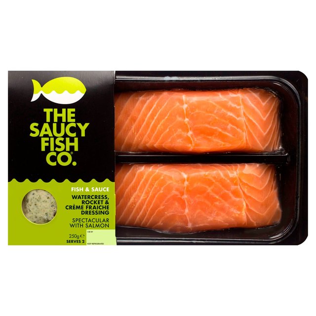
I love this branding as inspiration for a masculine packaging design. The dark black works well with the strong sans serif typeface. I like how they don't usually use imagery as well - just purely graphics. This keeps things simplistic. Clutter is removed, which is appealing to men.


No comments:
Post a Comment