

After some feedback, I made some final adjustments to my designs for the male packaging. In the end I chose to go with the handwritten style type version rather than the 'Pub Grub' style version - this is because after showing the designs to a variety of men, different ages and opinions, they all said they would be more included to buy the one with the illustrations on - purely because it looked 'cooler'!
I change the colours of the design slightly after feedback it looked too Halloweeny. I made the grey background much darker, to an almost black - it helped the white text really 'pop' out. I also adjusted the shade of orange to a darker, more rusty tone. This helped reduce the 'halloween' orange tone and looked more rustic against the dark background.

I added another circle onto the front of each sleeve - 'high protein'. Research suggests men are really interested in food with high protein content because to them high protein = more muscle mass. Both beef and cheese are high in protein, so this was appropriate to add to each design.

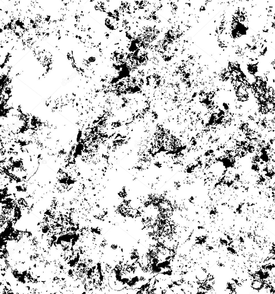
I also added a bit of texture to the overall designs - I used a vector image of a rough texture and made it slightly lighter than the background colour. I felt this stopped the background from being too flat and resembled a leather/stone texture - again relating to masculinity.

No comments:
Post a Comment